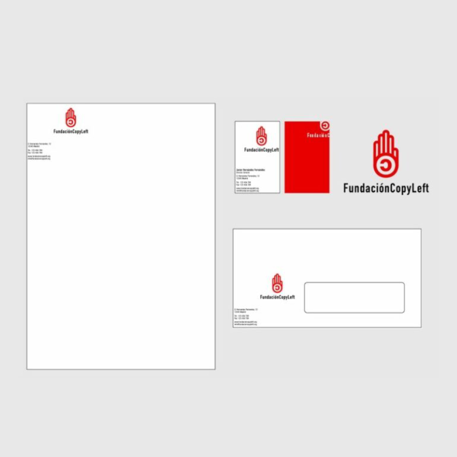
Where better than starting off with one of the first corporate identity projects I accepted as a freelance designer. But not only for being the first, also for it's social character. Global Canales started of as a socio cultural project... I am speaking about the Copyleft Foundation.

Visual Identity CopyLeft Foundation
The main target of The Copyleft Foundation is to promote and defend the production of art, culture and science under a Copyleft licenses. And they, logically, wanted to see that back in the corporate identity. Thanks to being involved from the moment it was born, I had a very clear view of the concept, the targets, public to target, competition and all the data you normally get from a briefing. Giving me an unique possibility to create an identity from within it's entrails...
Line of argument
The reversed "C" is the best known symbol depicting the Copyleft concept. It was created as an opponent of copyright. So I took this symbol as starting point for my construction. I used red because it provokes action and reaction... And to emphasize this quality I illustrated a hand that gestures: STOP! The hand is linear as if you can look through it. This symbolizes the transparent character that should have all services that involve social/cultural issues.

It still is an identity much loved by people working in the national cultural sector.
